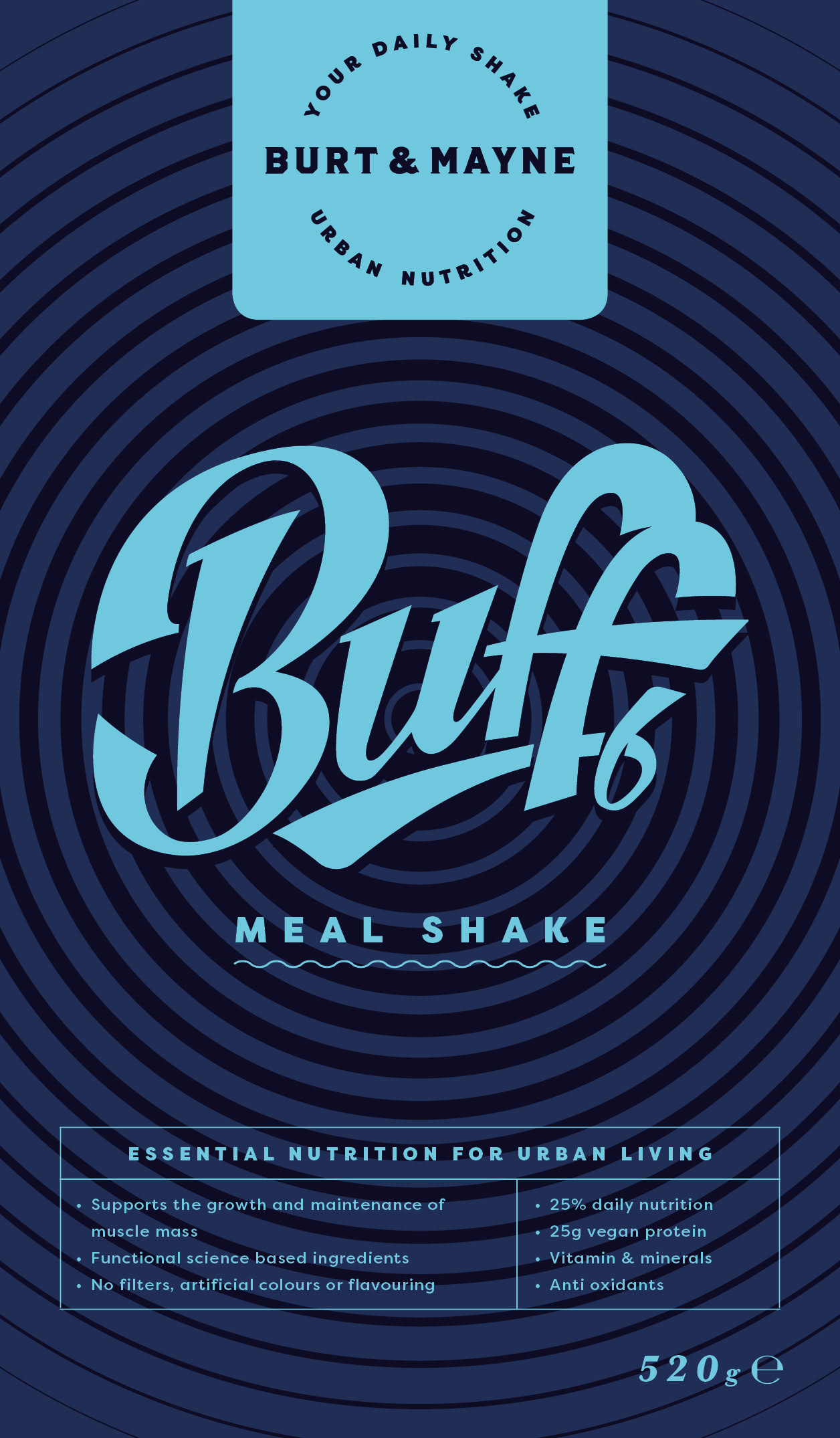
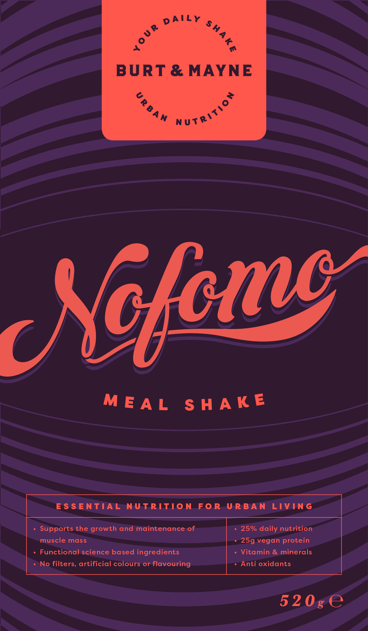

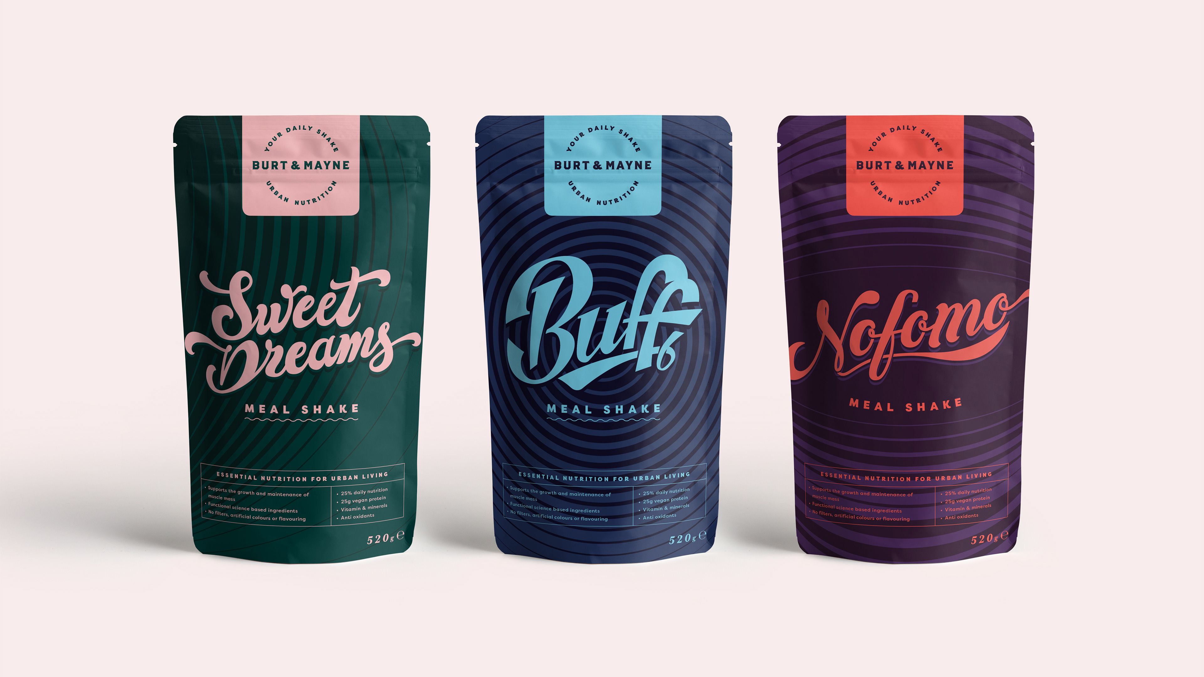

Another project that got shelved—this was a hand-lettering and packaging design I worked on for a protein shake branding project. I was experimenting with 80s nostalgia, retro colour palettes, and some funky hand-drawn lettering. It’s been a while so the details are a bit hazy, but somewhere along the way, the project shifted to a different product and never made it to shelves. Still, I thought it was worth sharing some of the designs here in the 'rough cuts' category.